Color theory is an important component when it comes to understanding colors and how to apply them for your digital painting. Let's dive into it !
In this article you'll see
Color theory explanation
Definition of color theory :
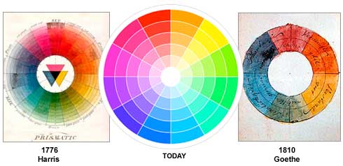
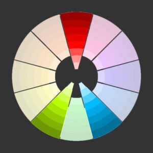
Color theory is a bunch of concepts and theory. Rules and guideline about how an artist can use colors to provoke balance, harmony and certain feelings in the eye of a viewer. We'll retain only four concept of color theory.The color wheel, color harmony and how context can affect colors. Also called as ''relativity'' and last but not least color psychology.The first attempt at making color wheel through history
Different configuration and combinaison of colors
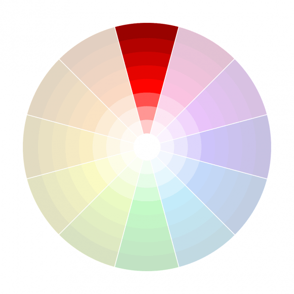
Monochromatic
A monochromatic configuration is easy and efficient when you are a beginner or when you want to keep your painting simple. The advantage is that you just control saturation and value of a color. If these two terms seems unknown to you, we made this article : How to understand colors easily Monochromatic configuration based on one color
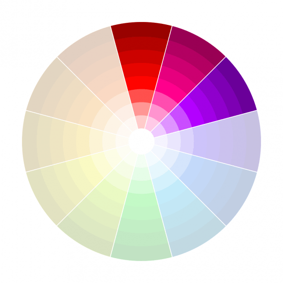
Analogous colors
Contrast is a dangerous weapon that can be flipped toward the person who use it. You can burn your colors or use two values/hue that aren't harmonious. That's why analogous colors combinaison has been created.it's particularly efficient to create calm atmosphere by using tones that are near the main color you choose.Analogous colors configuration
Few examples :
Analogous colors configurationUse of orange and little bit of red
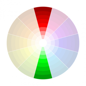
Complementary colors
Complimentary colors are the most usual color combinaison you can find on artwork. But what you surely don't know is how you can use it properly.Complementary colors configuration
People think it's as easy as choosing red and green and you're ready to go. NO. It's about choosing a red contrasting the green in term of value and saturation. It's about choosing a dominant color and a secondary complementary less dominant color.
Few examples
Due to color transition you can see some yellow but the touch of violet combined with orange follow a complementary color combinaison !
triadic combinaison
Triadic combinaison is something you must use carefully. Here is a good rule of thumb. Choose one dominant color and use it for 80% of your piece. And choose two other colors in the Equilateral triangle.Triadic combinaison
Few examples
Triadic composition by FinkART on twitterTriadic composition by Leonid Afremov
Split complements
It's about taking two complementary color as you would do for a classical complementary combinaison. Then, you just take one of the two and you select analogous colors. It gives more dynamism to your piece.Split complements
One example
Split complements combinaison
Complementary Doubles
this combinaison consist of choosing four complementary colors. Two from your head and two following the rule of color theory. A good rule of thumb is to use the first 2 as dominant and the 2 others as accent colors.Double complementary
One example
Double complementary by Pavel Romanov
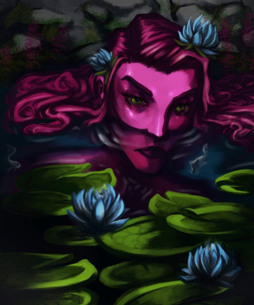
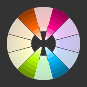
Relativity of colors
One image worth one thousand words.
Some general advices to paint colors better
Limit the number of hue in your digital painting to maximum 2 hue when you're a beginner. You can go up to 3 or 4 when you'll feel more confident.
Do not saturate your colors more than 60%
Use luminosity, contrast and saturation to guide or attract the eye in a specific place ( your focal point )
Do not use overlay, hard light or other blending mode without understanding what they do to your values.
Before starting to paint. Choose the ambience you want for your digital painting.
Invest in a good course. Not obviously Ashes courses. Study the summary of all the courses you meet and make a plan. Stick to it, learn, apply, until you become better.
Conclusion
We hope you had a good overview about the concepts that surround color theory and it's definition when it comes to digital art. If you want to go further, we suggest you some external and internal ressources.