Understanding colors and light as a whole aspect is not possible without taking a look to both of them. Because colors and light are two faces of the same piece.
In this article you'll see
Understanding colors ( Definition of color in art : )
Basiclly, you can see nothing without light. Close your eyes and everything disappear right ? If it's not the case we encourage you to just go on a laboratory, because you're probably from the X-man. The reason why you see nothing is because light is a wave, it strikes an object and what can be reflected to the human's eyes is called ''Color'' So basiclly the reason why sky is blue and grass is green, it's because the only colors these objects reflect are blue and green. In order to use colors for painting we (artists ) developed a way to handle and understand colors so that we can keep a good ratio beetween esthetic/realism and it comes through various knowledges, one of these is color theory.
properties of colors in art ( Understanding colors ) :
What a color is made of ?
hue :
It is simply the name of the color : red, blue, violet.
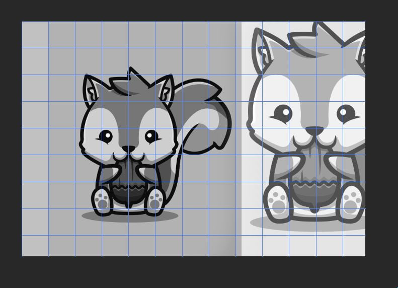
value : ( contrasting colours )
The brightness of a color represent how much a color is bright or dark. It is the degree of impact the light has on it if you want to simplify. Let's see an example of what is a drawing with contrast (good value ) and a drawing without contrast that can be boring to the eyes.In the right side of the picture, the squirrel have values that are less contrasted whereas in the left side, it is the opposite.
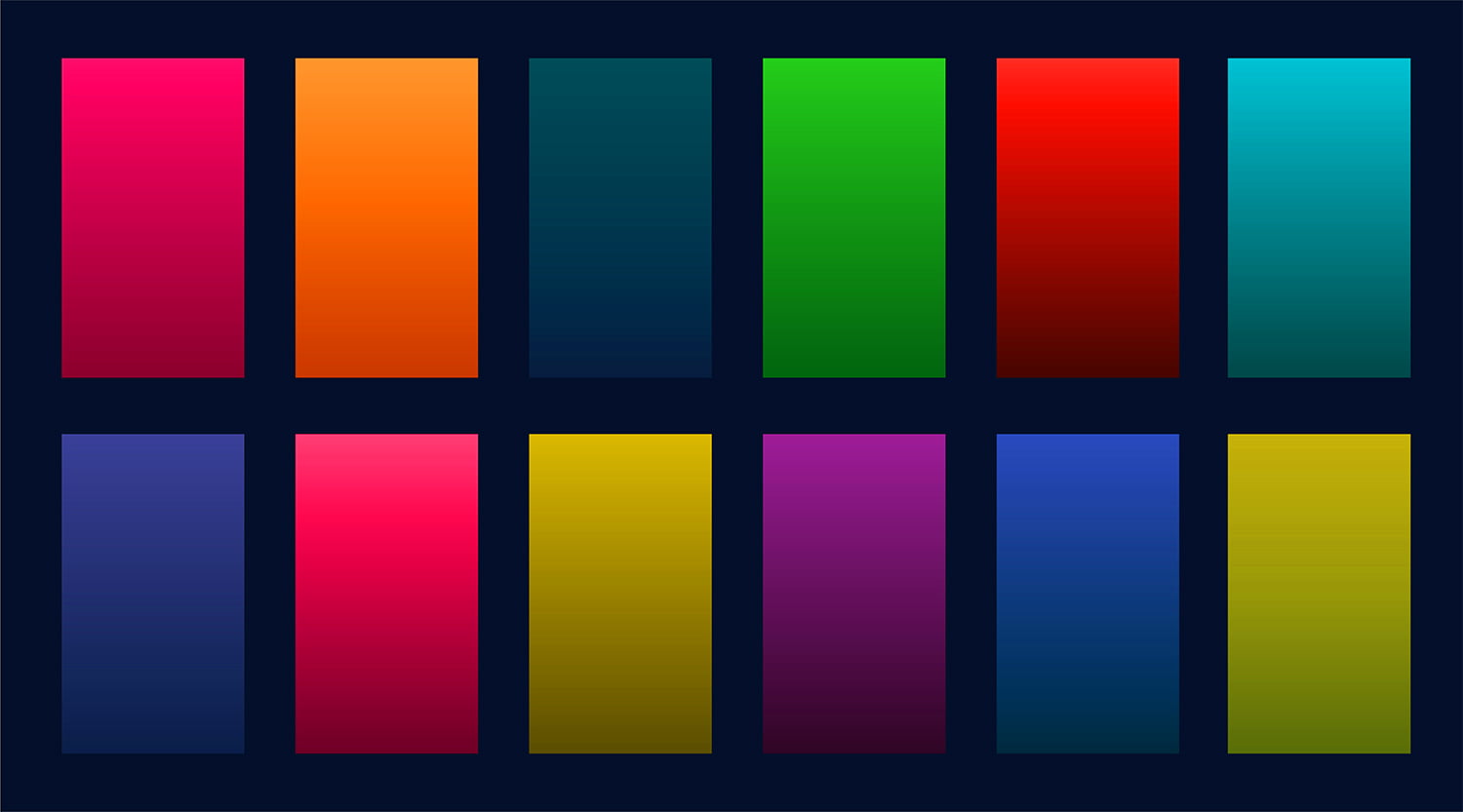
Saturation :
The saturation represent how much a color is vivid and pure, the more you mix it with grey, the more it lose it's purity and energy. Example :
Colors make the piece : Understanding colors and light
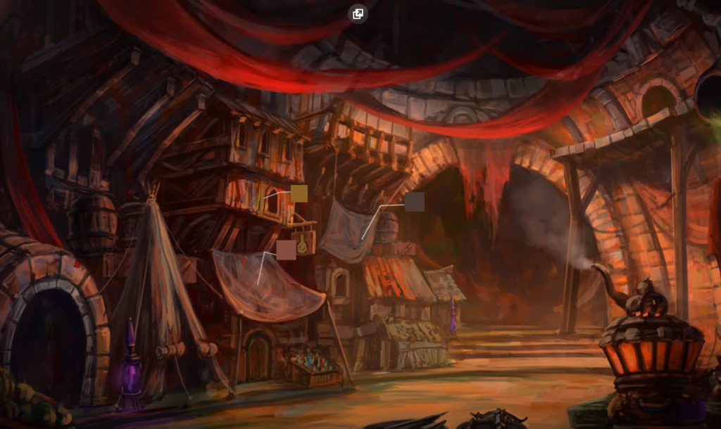
Some brillant people created what you may know as ''Color theory'' Color theory is a theory and every theory has weakness and case where it can't be applied. But most of the time, color theory will help you to construct your piece. Let me show you an artwork almost entirely in red so that you can understand how much simplicity can bring results, even if you have a complex projects. This artwork has been made with Analogous colors
Analogous colors :
Mastering the ambience of your artwork is essential if you want to reach the point of greatness. that is what we call an analoguous combinaison. you choose a color and you derive the whole piece from one color and the colors beside it (in this example, red, orange, yellow dominate the scene. ) The magic succeed when the viewer start to think that the blue he is seeing is a real blue while it's just desaturated red tone. ( see the image above for an accurate understanding )
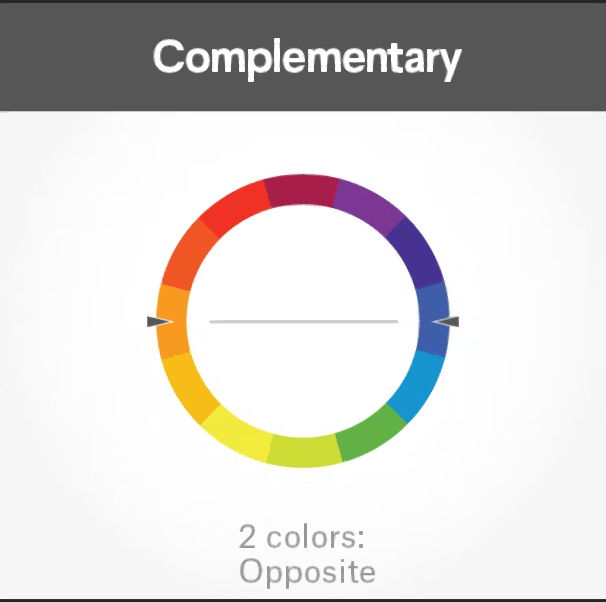
Complementary colors :
Red go with green, violet go with yellow ... You surely learned this in school, if not. You have to know that complementary colors are deeper than that. You can't simply combine any green with any red. Because the first goal through complementary colors is to create contrast. If you put your piece into black and white and you see that the green you picked doesn't contrast with your bright or dark red. Then it is probably because you picked the wrong one. So when you build your complementary colors, take in account what we saw : Values and saturation.


 Red go with green, violet go with yellow ... You surely learned this in school, if not. You have to know that complementary colors are deeper than that. You can't simply combine any green with any red. Because the first goal through complementary colors is to create contrast. If you put your piece into black and white and you see that the green you picked doesn't contrast with your bright or dark red. Then it is probably because you picked the wrong one. So when you build your complementary colors, take in account what we saw : Values and saturation.