Color theory explanation : 3 proven tips to change your digital painting !
2024-07-31
Color theory is an important component when it comes to understanding colors and how to apply them for your digital…

Color theory is an important component when it comes to understanding colors and how to apply them for your digital painting.
There is no rules of thumb that apply to all cases. However, you can find specific rules for specific combinaison depending on the number of colors you wanna implement and the degree of their values.
You can know more about values in a previous article made here.
In order to combine colors, you must know there is proportion guideline for each one of them.
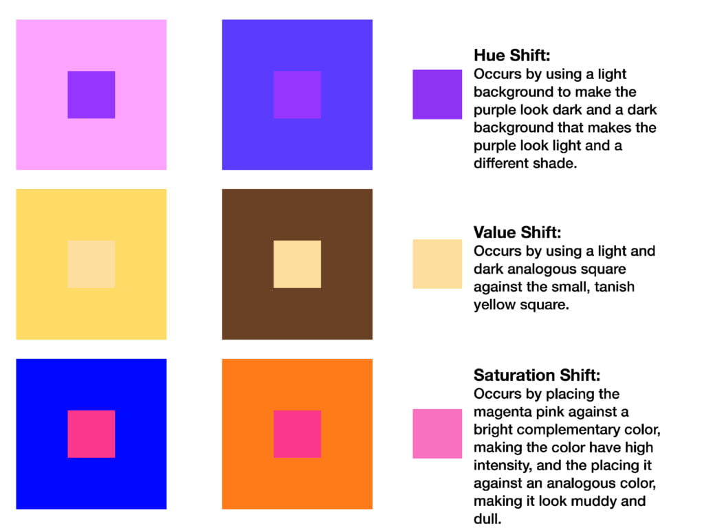
A monochromatic configuration is easy and efficient when you are a beginner or when you want to keep your painting simple. The advantage is that you just control saturation and value of a color. If these two terms seems unknown to you, we made this article : How to understand colors easily.
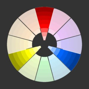
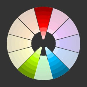
Contrast is a dangerous weapon that can be flipped toward the person who use it. You can burn your colors or use two values/hue that aren't harmonious. That's why analogous colors combinaison has been created. it's particularly efficient to create calm atmosphere by using tones that are near the main color you choose.

Some examples for you to visualize how you can implement it :

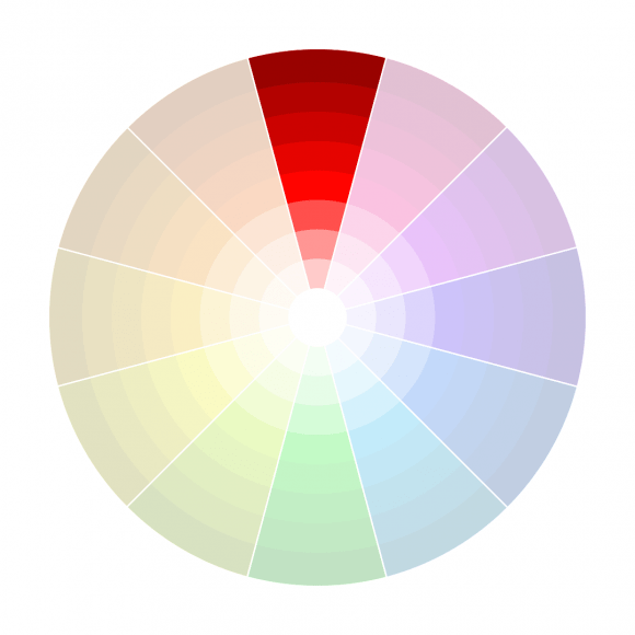
Complementary colors follow the principle of contrast. Hot vs cold. Naturally those who oppose each others on the color wheel.
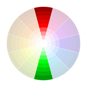
Complementary colors are the following : red and green, blue and orange, and yellow and purple.
Complimentary colors are the most usual color combinaison you can find on artwork. But what you surely don't know is how you can use it properly.
People think it's as easy as choosing red and green and you're ready to go. NO. It's about choosing a red contrasting the green in term of value and saturation.

Triadic combinaison is something you must use carefully. Here is a good rule of thumb. Choose one dominant color and use it for 80% of your piece. And choose two other colors in the Equilateral triangle.
It's about taking two complementary color as you would do for a classical complementary combinaison. Then, you just take one of the two and you select analogous colors. It gives more dynamism to your piece.
One image worth one thousand words.